Niji
Branding, Naming, Web design
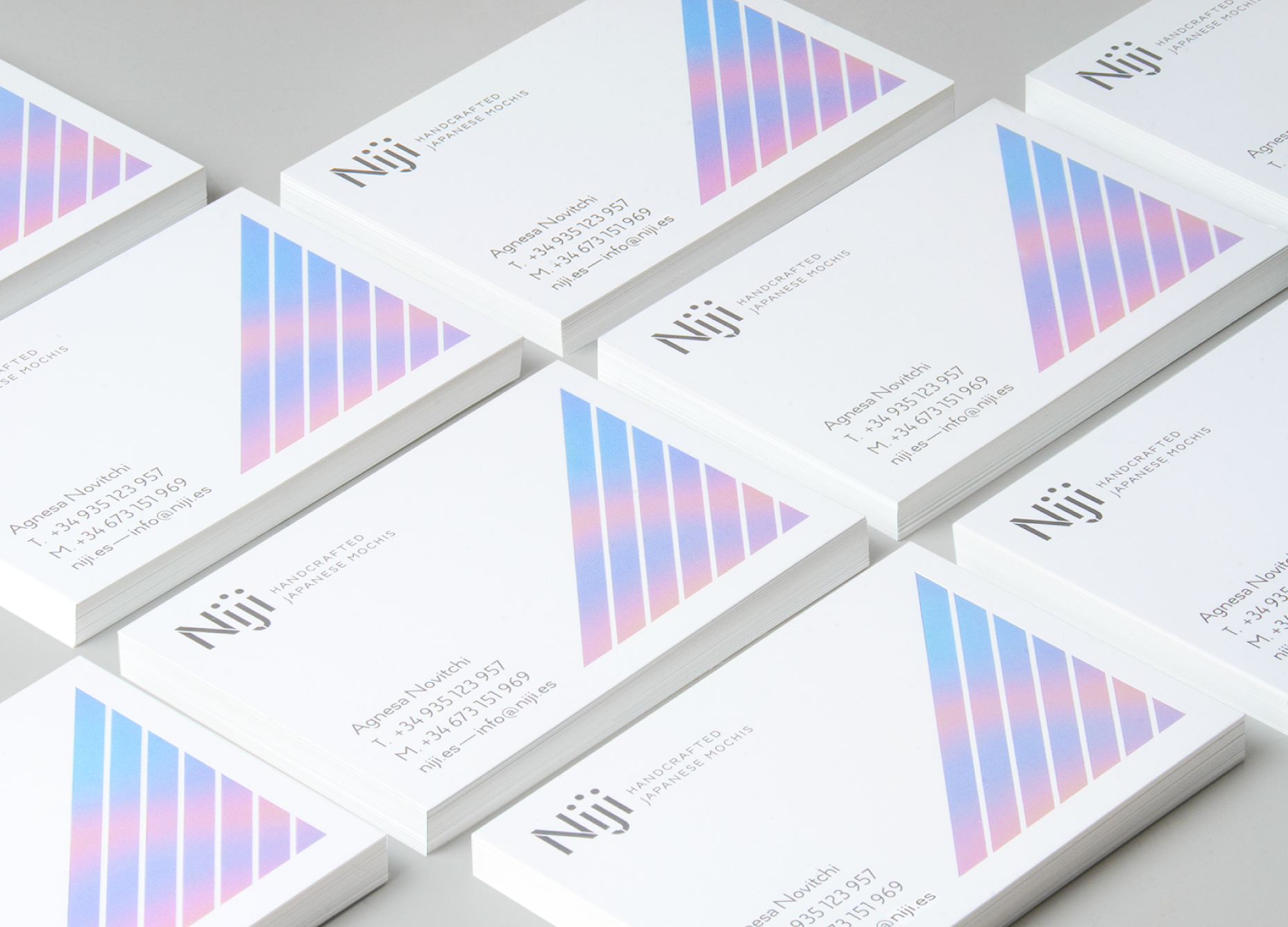
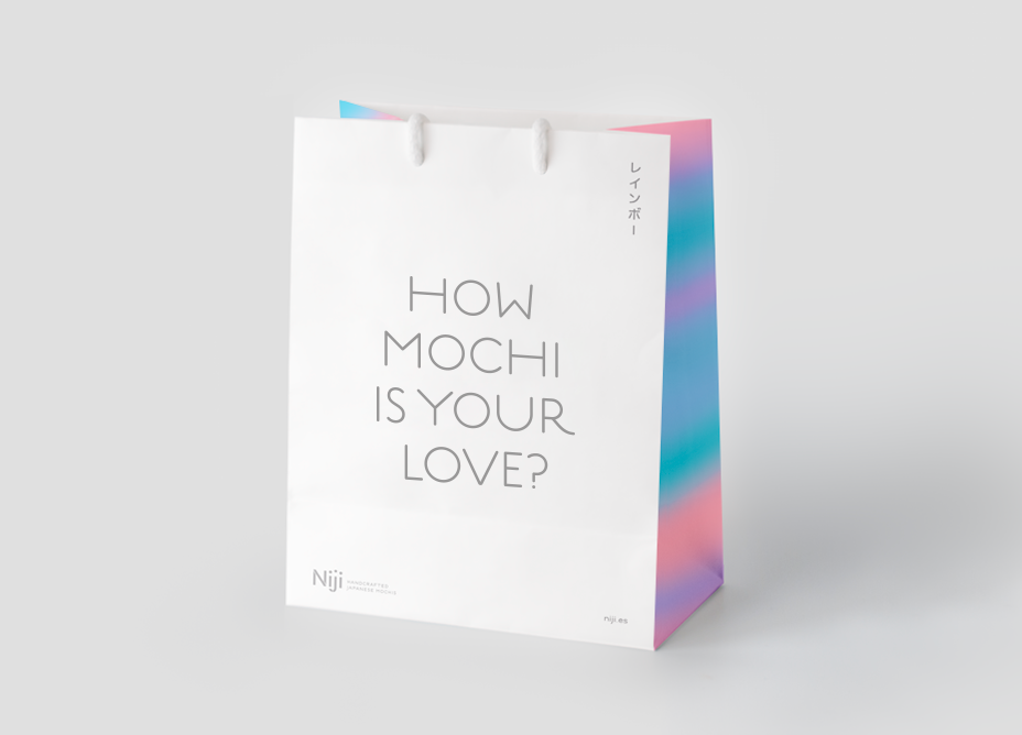
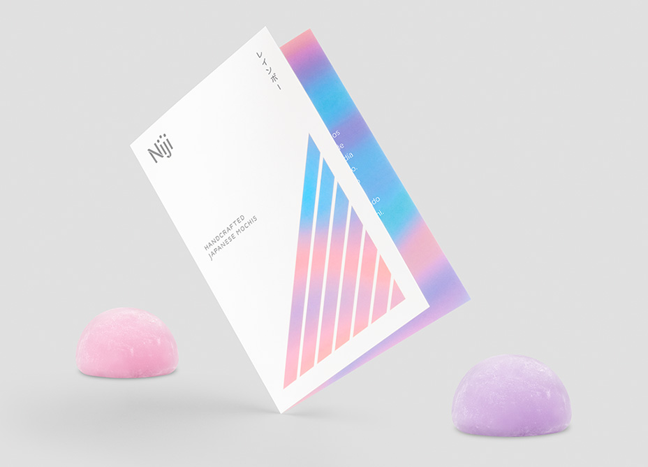
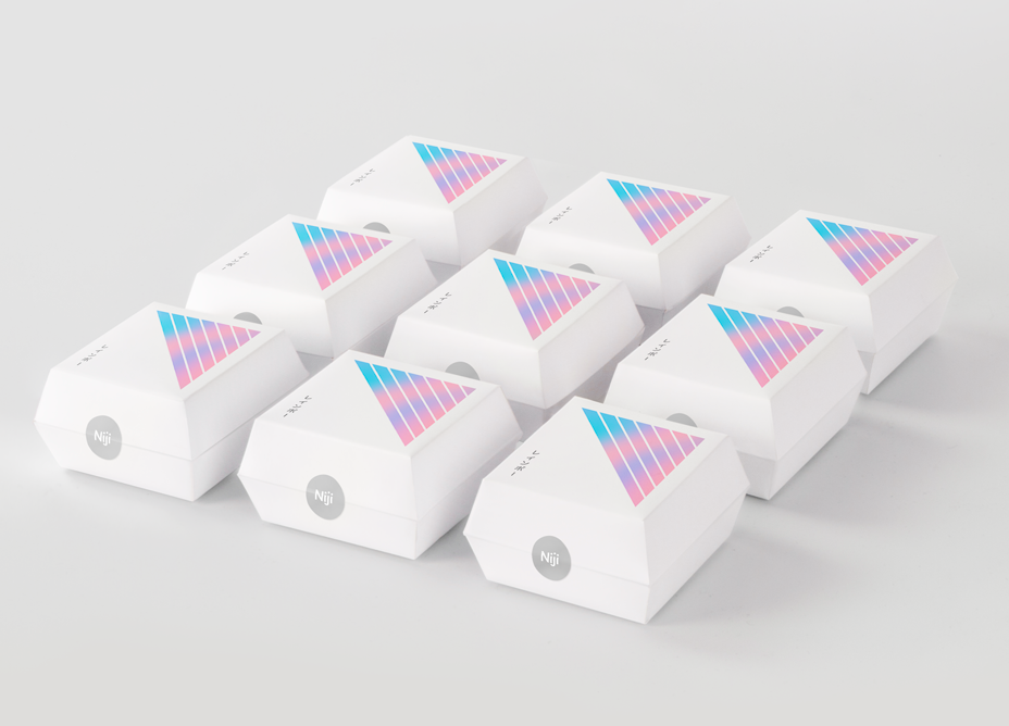
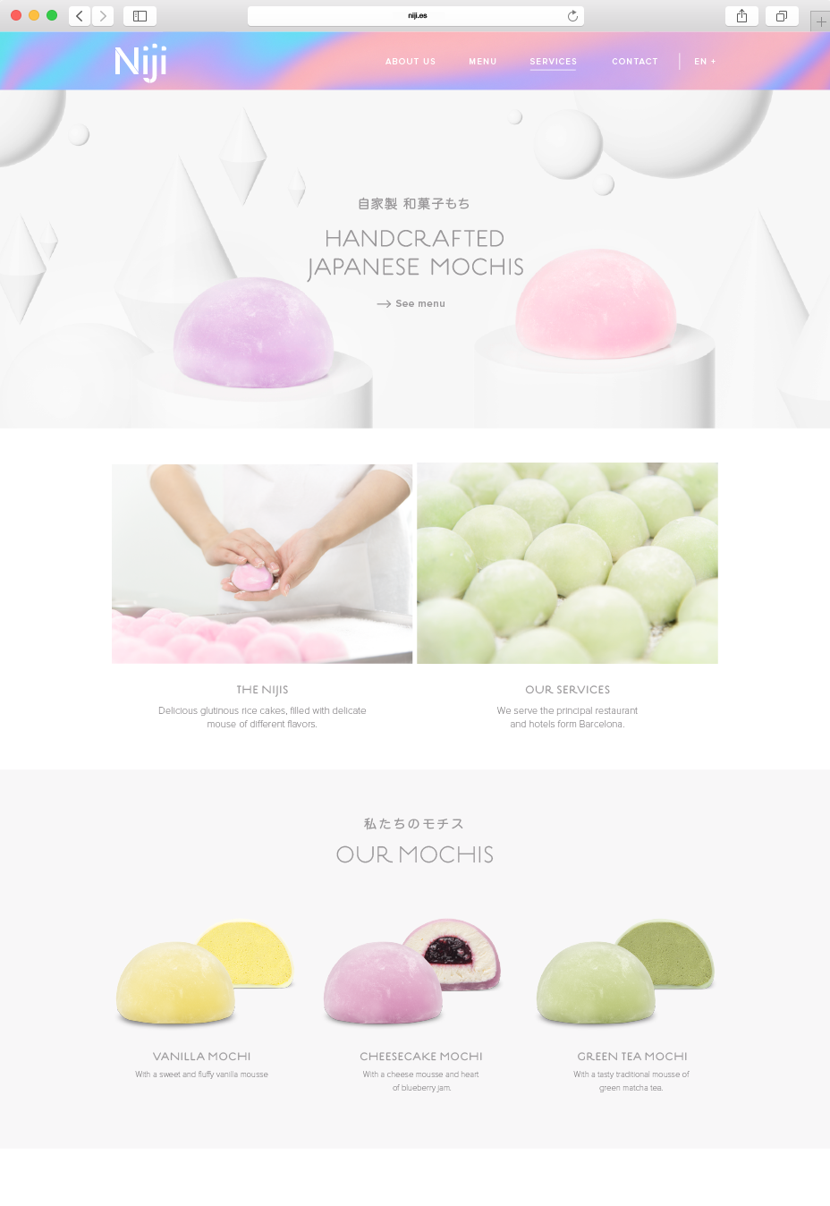
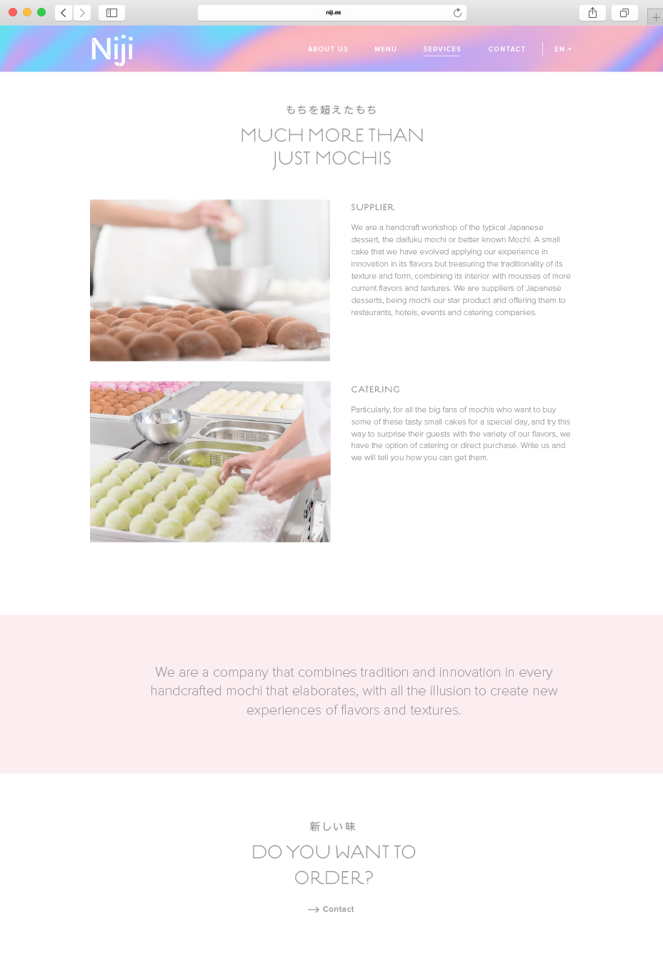
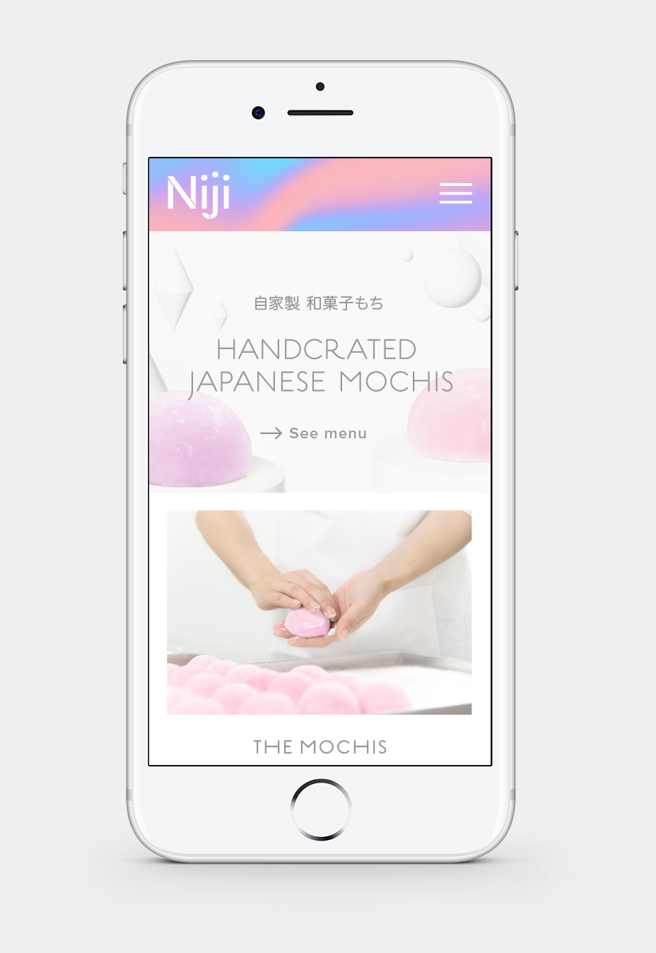
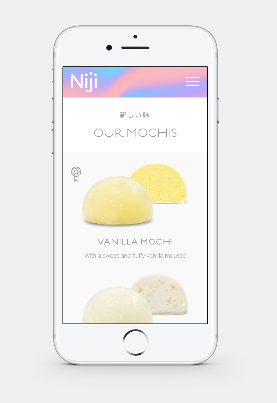
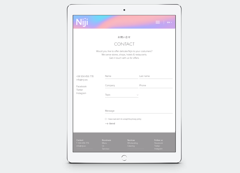
Branding, naming, packaging and web design project for Niji. A business specialised on handcrafted mochi production.
The branding strategy aims to promote the mochi consumption as a trend within the spanish market, separating it from the casual consumer asociated with the traditional pastry shop.
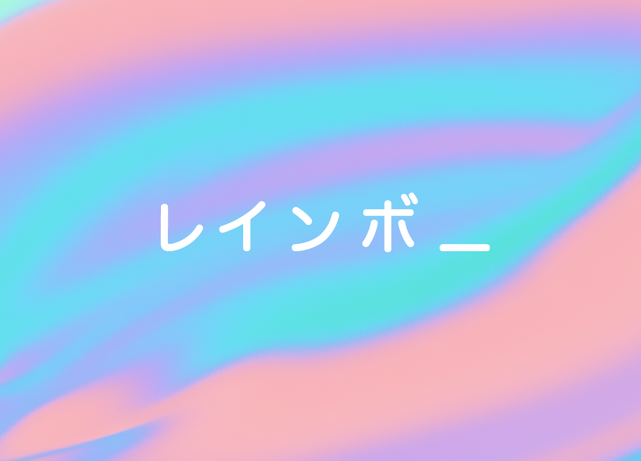
The Niji naming means rainbow in Japanese. We’ve taken benefit from its concept and developed a multicolor light spectrum within a world of fantasy, with a sweet and fluffy sense. At the same time, we’ve replaced the overused seven line bow with a triangular shape, that fits quite better to the packs and conveys a sophisticated look through the use of diagonals.
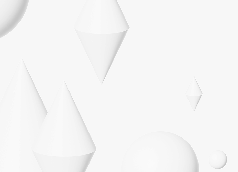
3D Photo
Alberto Bohera